GRAPHICS AND PRESENTATION DESIGN
Case Study
The project
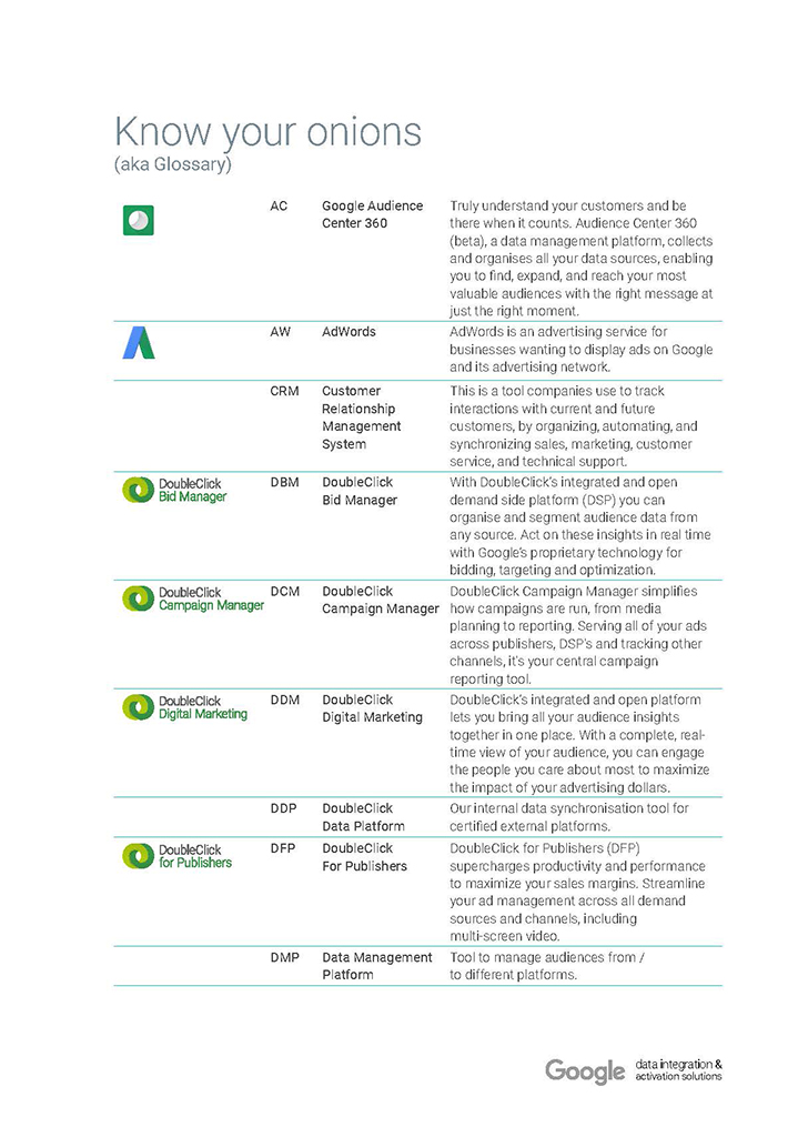
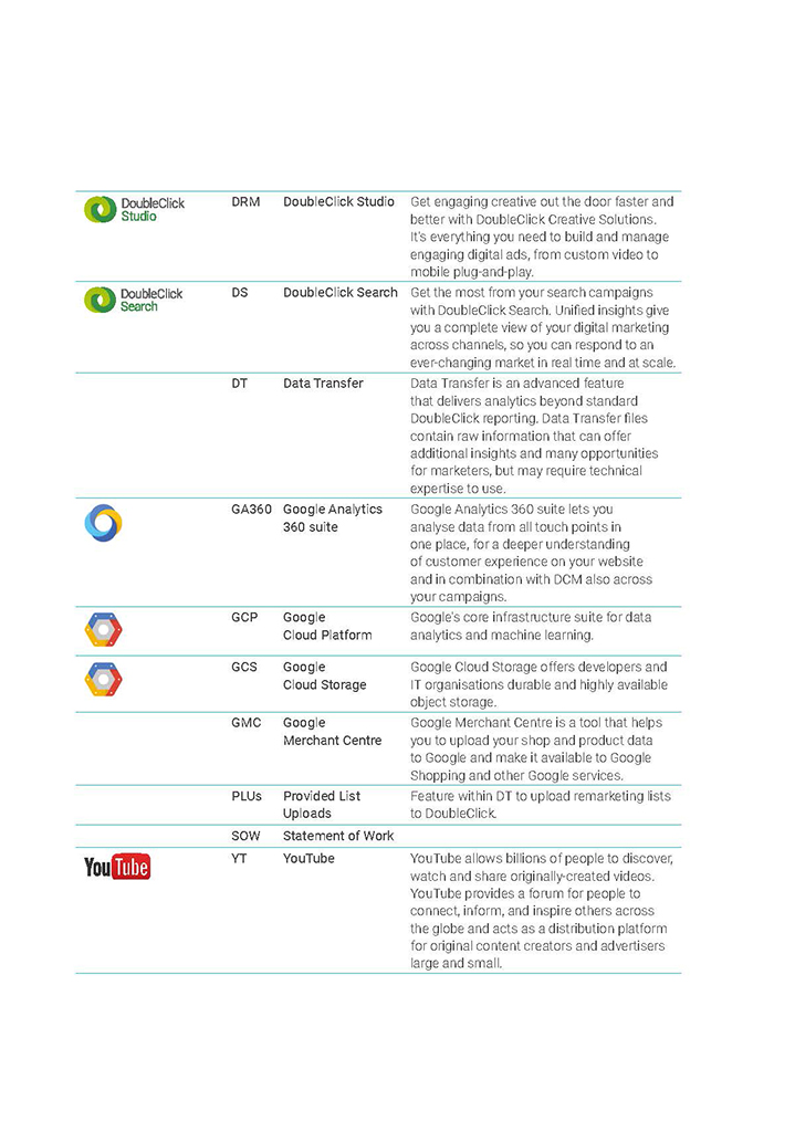
DoubleClick is a suite of Google products used for managing digital advertising campaigns and delivering ads across the web. It’s a platform that helps advertisers and agencies create, manage, and optimise campaigns, offering tools for ad serving, bidding, and targeting. DoubleClick was originally an independent company before being acquired by Google.
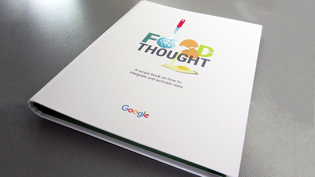
Final output: A hardback printed 3-ring folder with spot UV on the cover, cut out dividers, fold out TOC, hole punch pages that could be removed/updated as products evolve, printed by TFW printers.
Client
Google (DoubleClick)
Categories
Graphic Design, Print
Date
2014
Products
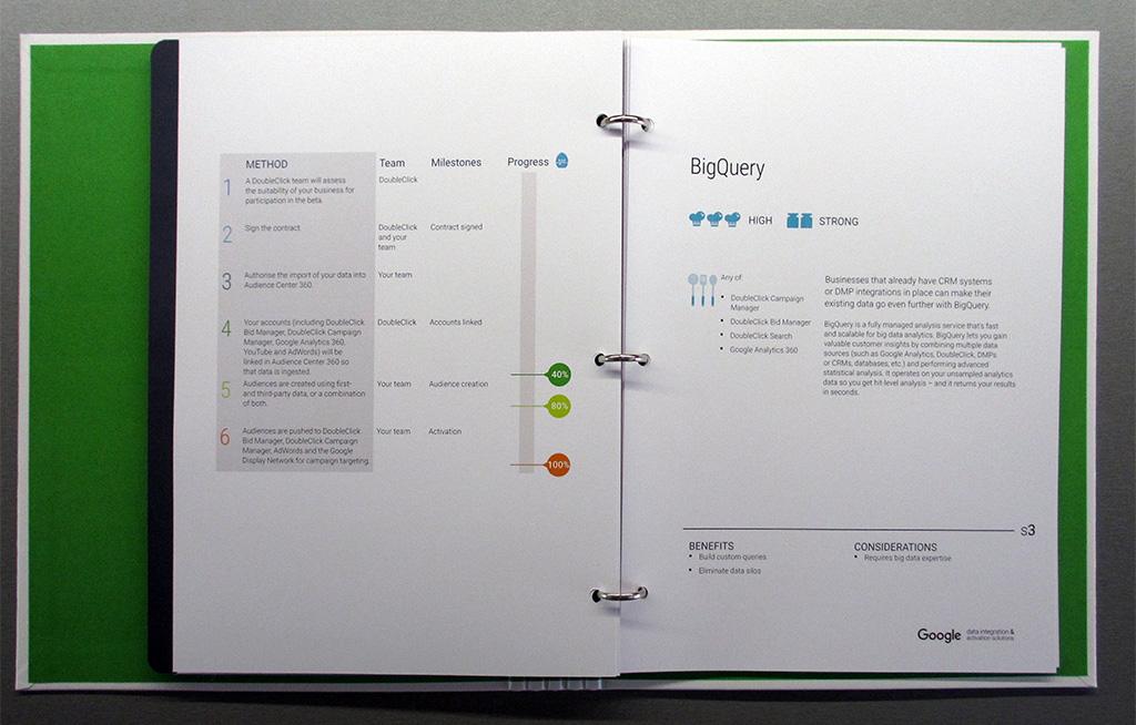
DoubleClick Bid Manager and Campaign Manager (now Display & Video 360) and DoubleClick Search (now Search Ads 360).
My role
My role as a graphic designer is to communicate visually and solve problems. I take ideas, information, and objectives and translate them into visually engaging and effective solutions for brands and audience creating using a variety of design elements.
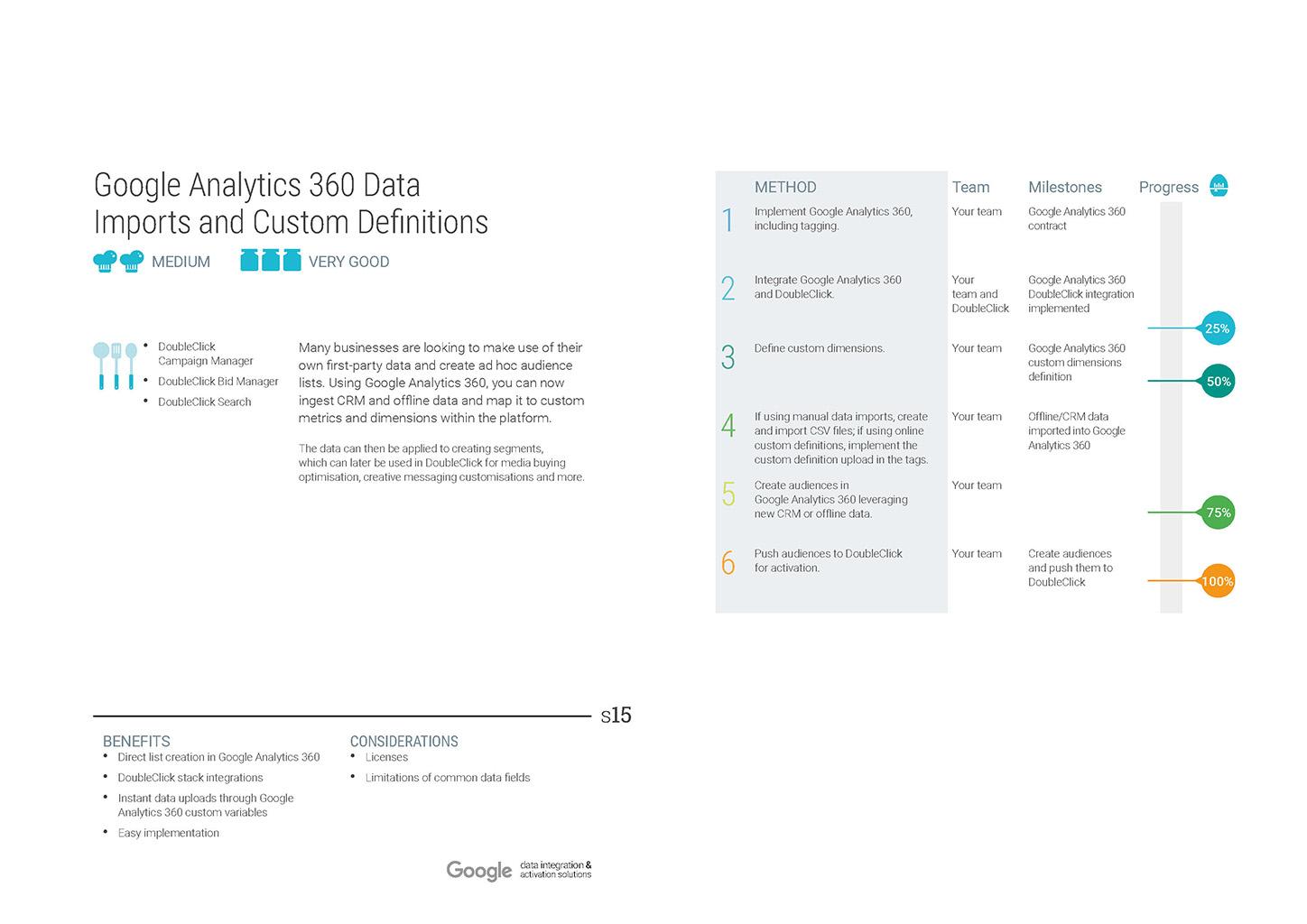
The brief was to create a highly visual and engaging, ‘plain’ English, marketer’s guide to Google DoubleClick advertiser products (now largely integrated into the Google Marketing Platform). The finished product was to be high end, fully branded, using Google visual identity system (colour palette, typography, illustrations style).
The challenge
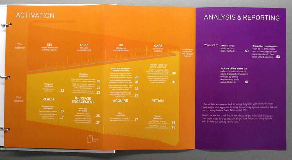
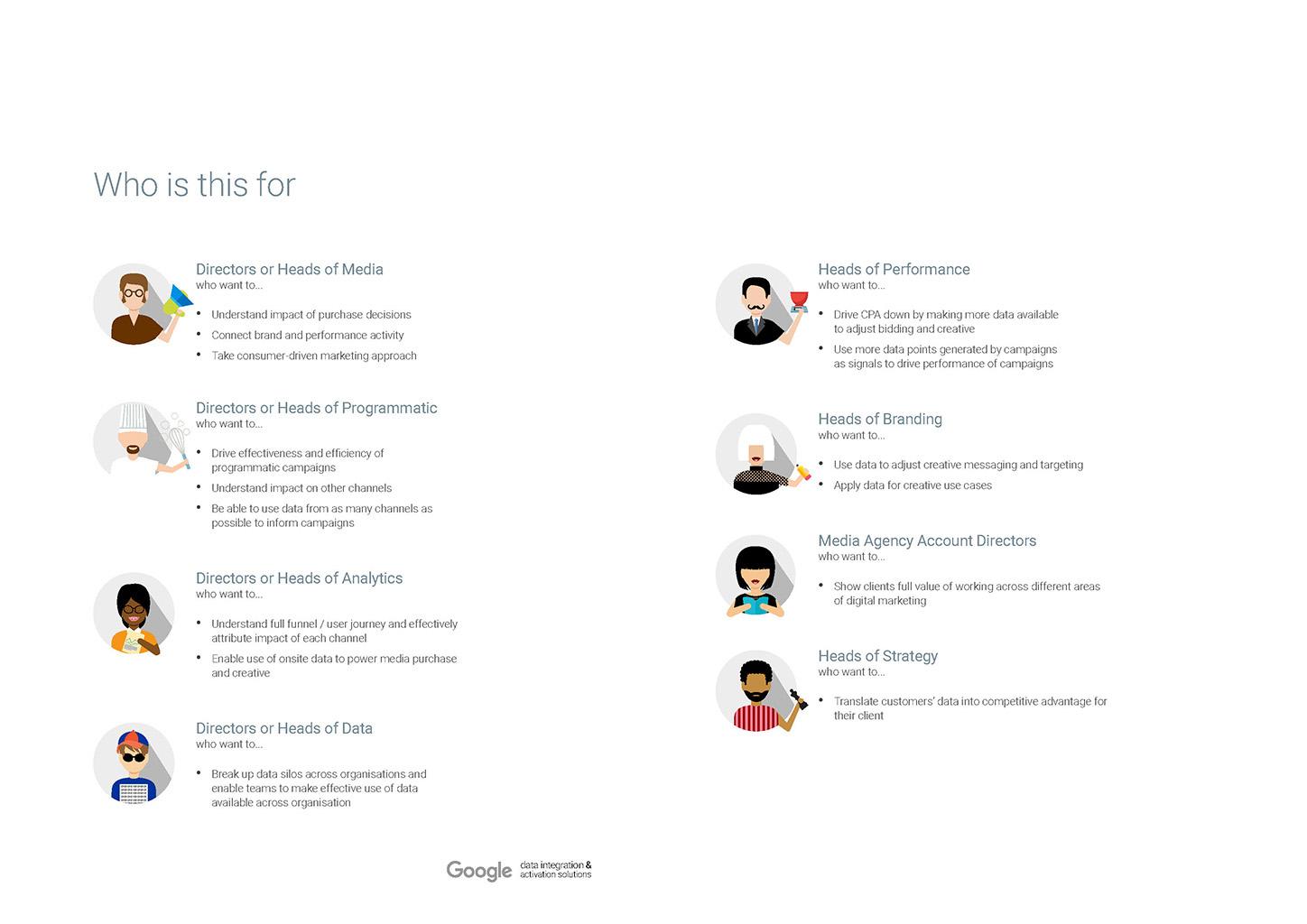
DoubleClick advertiser products are designed to help advertisers manage and optimise their digital advertising campaigns by allowing advertisers to plan, buy, measure, and optimise their digital media and customer experience. Google sales rep discovered that choosing the right tool was daunting and at time complex for marketers. As a consequence, they needed an output that would be making it accessible to a non-technical audience. Therefore, I needed to make the suite of highly technical products easily understandable so that decision makers would design the right strategy.
Additional benefits
- Differentiate from competitors: In a digital only world, handing out a physical book was very unusual
- Elevate the perceived value of purchasing the DoubleClick advertiser products
My approach
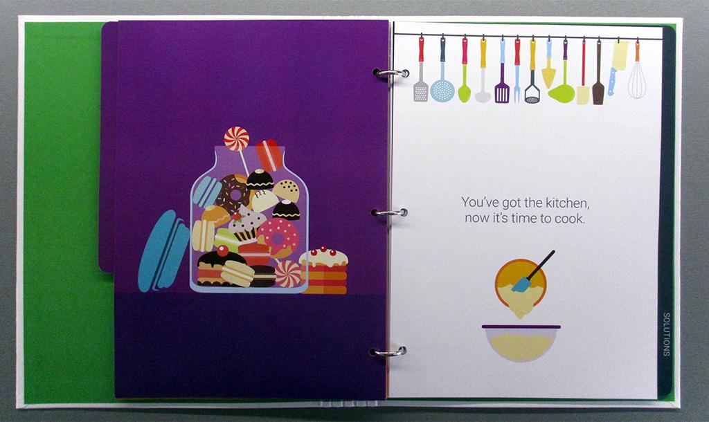
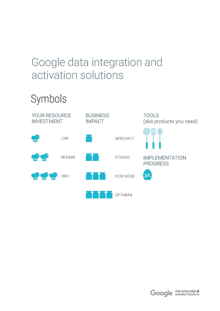
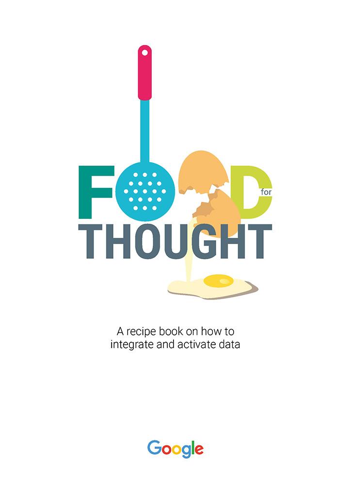
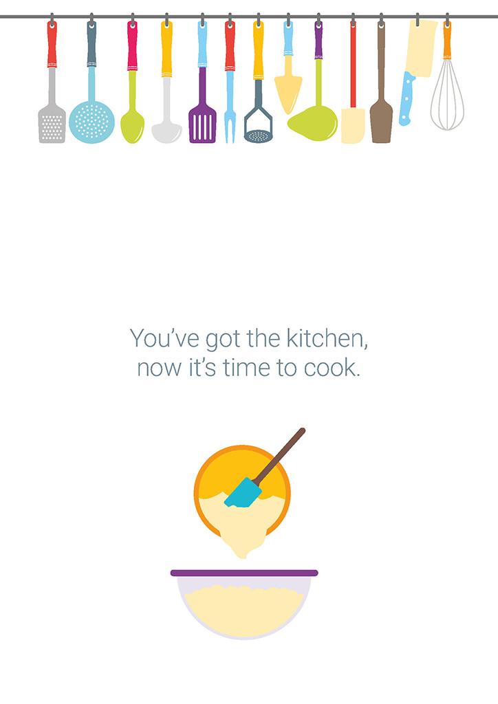
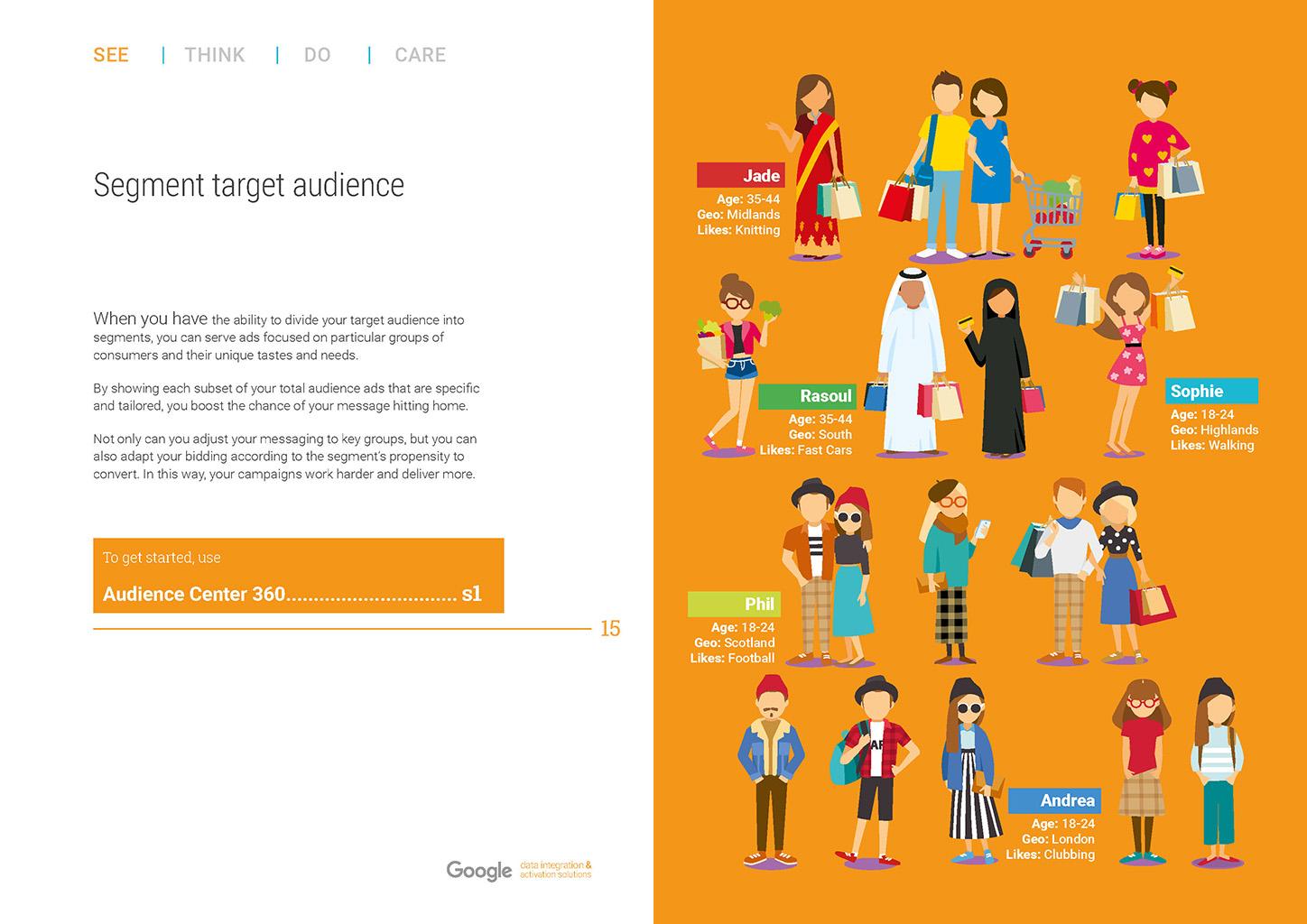
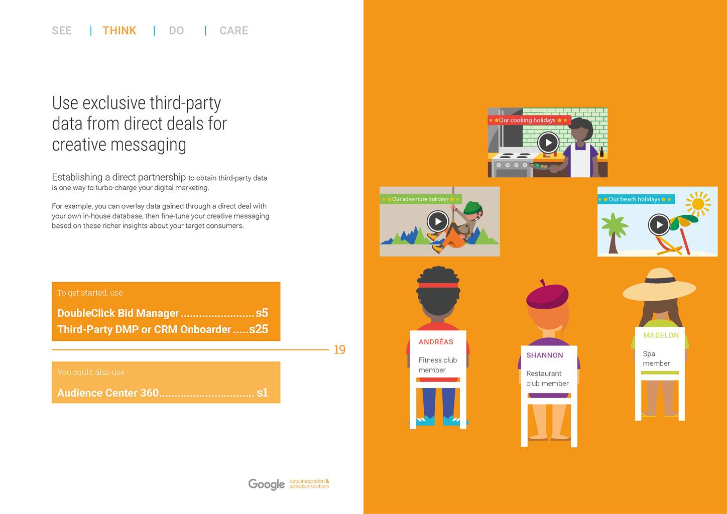
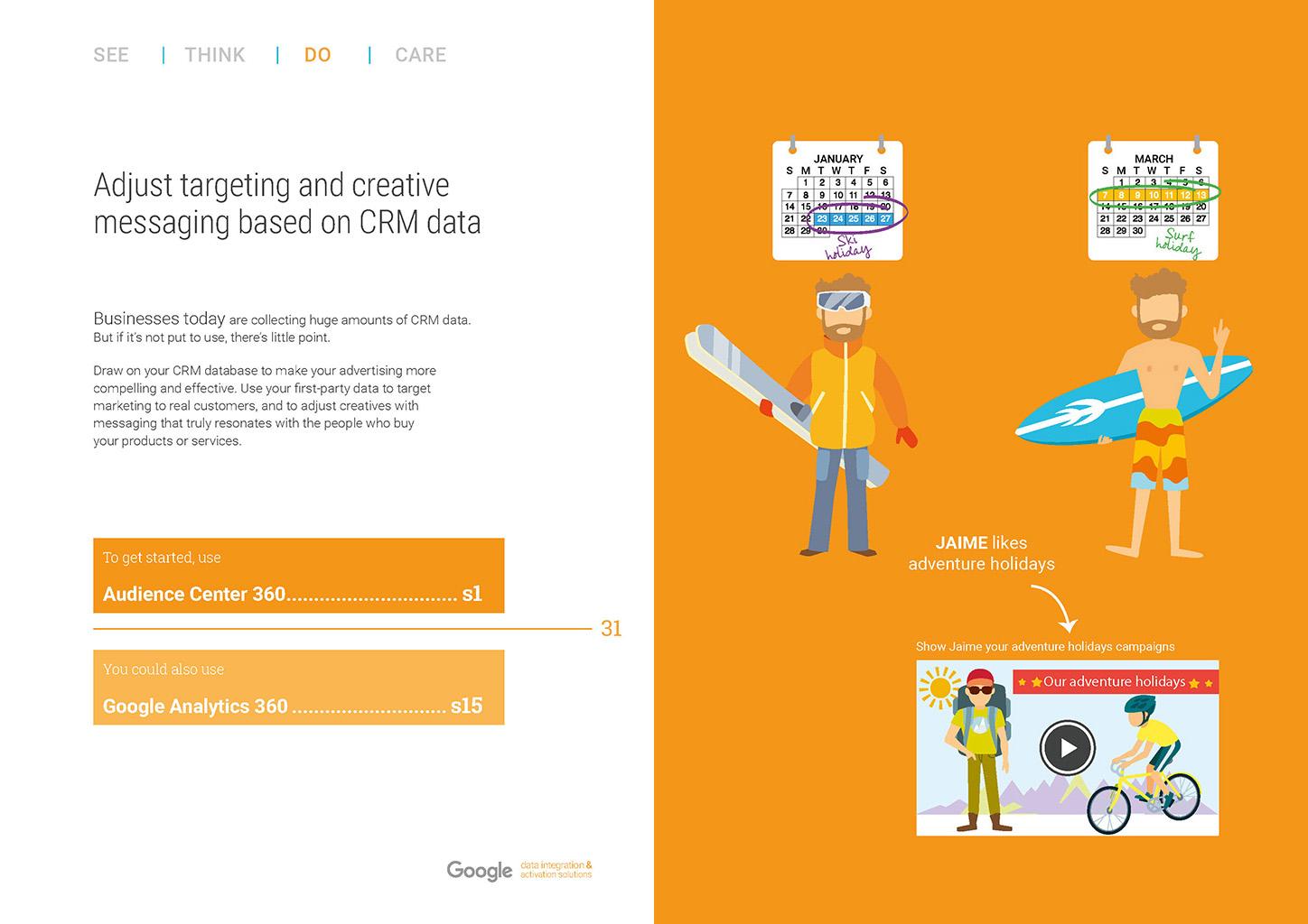
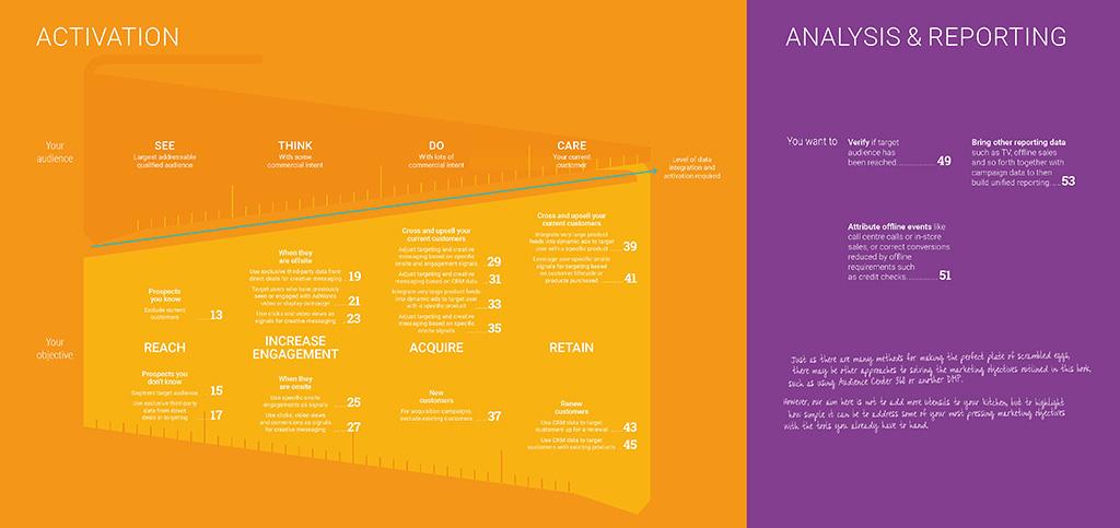
As non-digital tech expert myself, I immediately understood the challenge. A long, multi-tab, Google spreadsheet listing the advertiser products, their characteristics, the solution they solved was the technical content. I embarked on a collaborative process with the engineers, focusing on understanding the solutions and the problems they solved. The novelty of my design was to articulate the entire project starting from the client’s marketing objectives, backward to the suite of products. I envisioned those products as a recipe to help marketers create, manage and grow high-impact digital marketing campaigns.
My approach included
- Discovery and research: We conducted a thorough review of the document
- Conceptualisation and design: Based on the discovery phase, I came up with this idea of a recipe book with the sale funnel and marketing objectives as a starting point. The marketing funnel would suggest the relevant products depending on the marketing objectives.
Playful copy
To support me, a technical copywriter rewrote the excel spreadsheet in plain English whilst I wrote playful headlines following our culinary recipe theme.


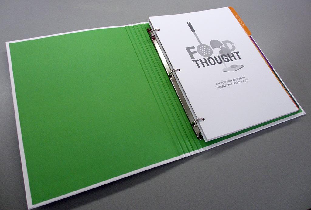
The final output
The final output was a hardback printed ring folder with spot UV, cut out dividers, fold out TOC, skipped ring bind and hole punch pages that could be removed/updated as products evolve
Printer: TFW Printers
Visual identity
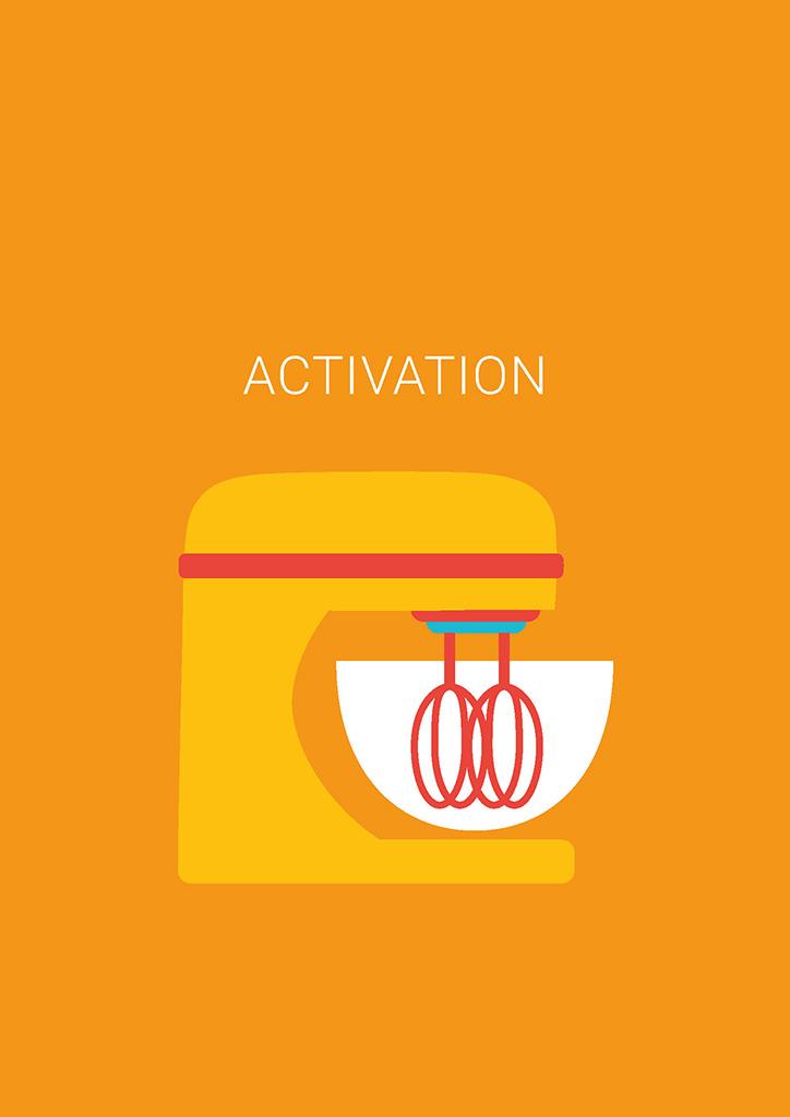
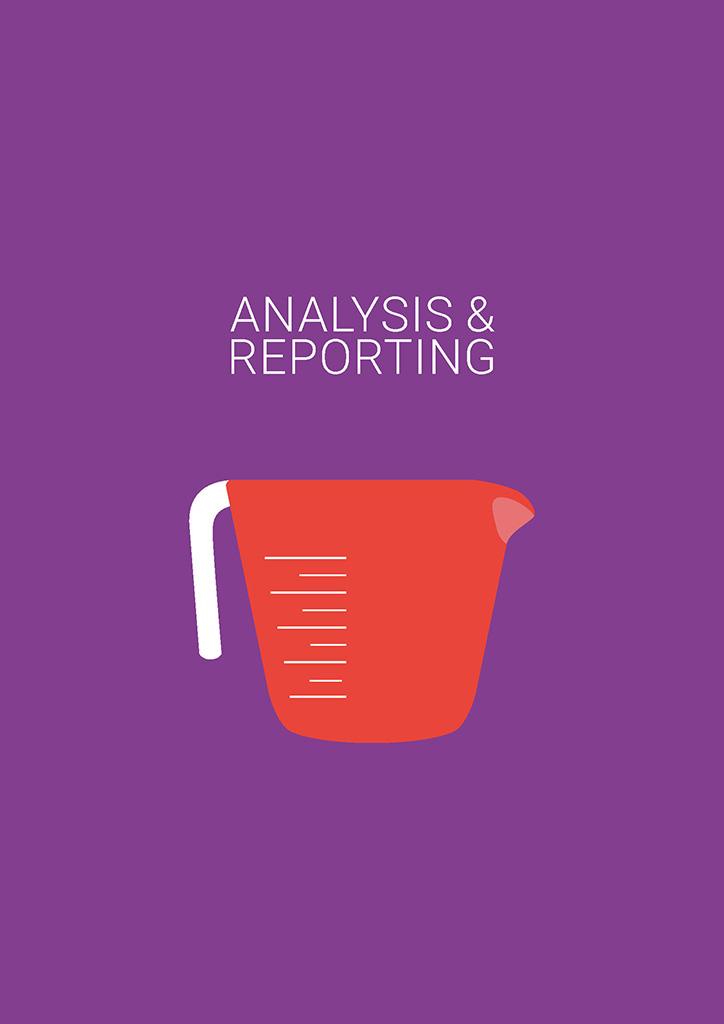
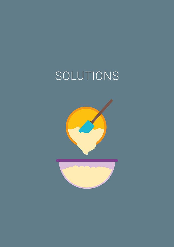
Google has a large resource of assets and brand guidelines available so that I was able to base my design on their Colour Palette, Typography. I used their Illustration Style to create a specific set just for the recipe book. I created additional subtle graphic elements inspired by recipe books to be used as visual cues across the different products recipes.
Impact
The design of the recipe book resulted in a significant positive impact:
- Elevated Brand Perception: The novel format effectively communicated the extent of the suite of products and its implementation, attracting a more discerning customer base.
- Positive Emotions and Increased Engagement: The modern and appealing visual identity resonated with a non-technical audience, leading to increased requests
- Stronger Customer Support: The kinetic and playful ‘recipe book’ created a professional and engaging tools for sales representative.
- Positive Customer Feedback: The book proved so popular with UK customers that other markets (Spain, Nordics, etc.) also requested copies to be printed out for their customers.
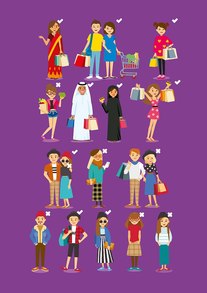
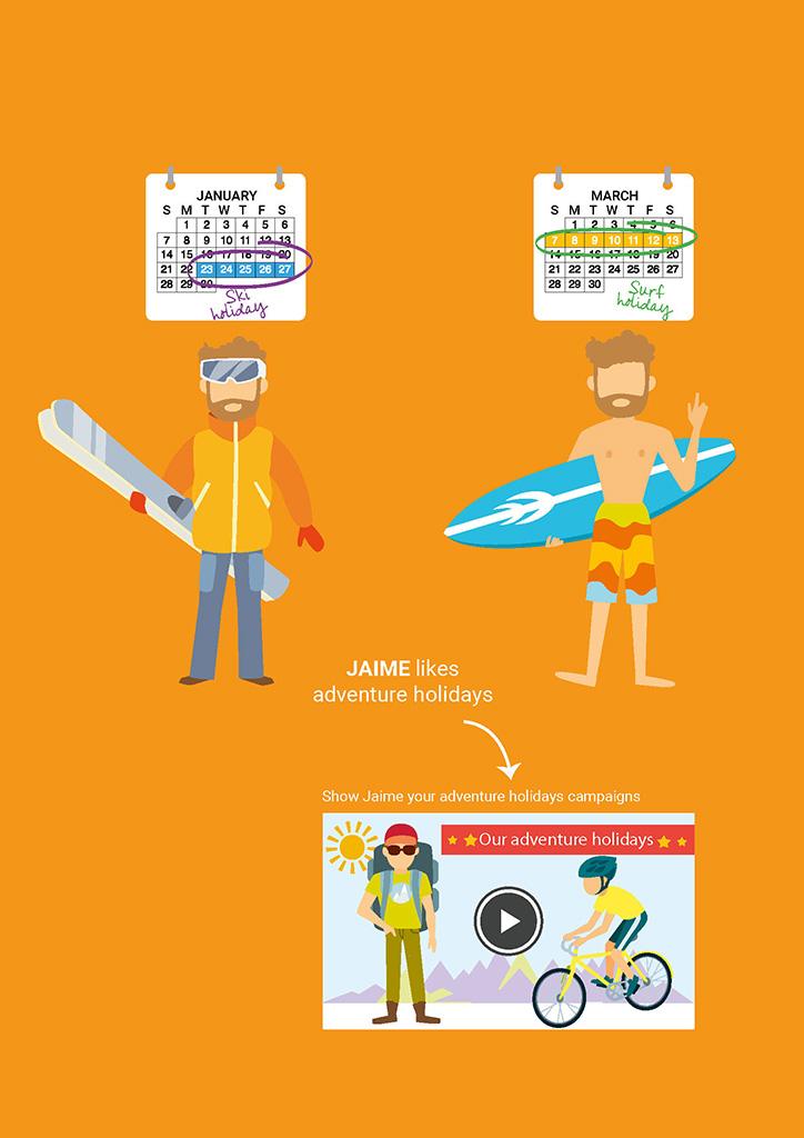
Illustrations created specifically for the project
Gallery
Photos credits to the respective authors